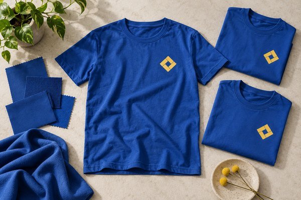
Campaign T-shirt color matching involves different surfaces and different approval decisions. The dyed garment and printed logo can each look plausible separately yet appear poorly coordinated when brought together. A brand manager approving a screen image may also expect more precision than that image can establish. The buyer needs physical references and a clear comparison process, not an undefined promise of perfect color.
Specify garment and print colors separately, approve the finished combination and control the relevant material lots. Agree how differences will be reviewed before bulk production. Use photographs for communication alongside appropriate physical or measured references.
Symptom: the garment differs from the mockup
Identify what was actually approved. A digital visual communicates direction, but display settings, lighting and image processing affect its appearance. Ask whether a fabric sample or finished garment was established as the purchasing reference.
Compare the proposed shirt with the retained reference under an agreed viewing condition. Record their identifiers and the approval owner. This avoids comparing unrelated images from different phones and treating their differences as evidence of a fabric problem.
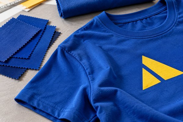
Symptom: the mark changes on a dark shirt
The underlying garment and print setup can affect the finished appearance. Ask the decorator to explain the proposed process, including any underbase or additional layer. A color code does not describe every production detail needed to reproduce the result.
Review the logo at its actual dimensions on the selected garment color. If a process adjustment is needed, approve the complete decorated sample. Keep that sample linked to the final artwork rather than allowing the physical and digital references to diverge.
Symptom: supplier samples disagree
Confirm whether both suppliers used the same material and physical target. One may have offered a stock shade while another interpreted the request as custom development. The difference can result from purchasing assumptions rather than poor execution.
Explain whether an available alternative is acceptable. If close matching is essential, ask about development, quantities and schedule before making commitments. Compare costs against the same target so one proposal is not judged as if it includes work requested only from the other.
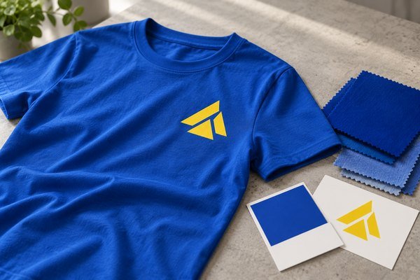
Symptom: different deliveries look inconsistent
Ask how fabric lots are identified and reviewed. Where an order spans several lots, discuss the comparison process and whether lots remain separated through production or packing. The buyer should understand the control plan.
Retain approved fabric and print references. Review a proposed new lot against them before use. Record whether the difference is acceptable and whether distribution needs attention, particularly where garments from several deliveries will be worn together.
Distinguish visual review from measurement
A visual approval and an instrumental color assessment are different activities. If measured results are required, agree the method, settings, reference and acceptance requirements with qualified personnel. A number without those details can create false confidence.
For routine purchasing, an identified physical comparison may serve the brief. More demanding brand programs may need formal measurement. Choose the control according to the actual requirement rather than requesting technical-looking data without knowing how it will be used.
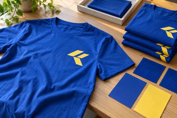
Keep print and fabric revisions distinct
A new print color is not the same change as a new garment shade. Track each revision and identify the sample showing the final combination. Assess its effect on setup, material availability, cost and decoration behavior.
Use a color register with garment reference, lot information, artwork version, print reference, sample date and approval owner. Add photographs for convenient communication. Keep the appropriate physical target available when a photo cannot support the exact comparison.
Review the wider campaign relationship
If shirts need to coordinate with caps, bags or banners, bring samples together for approval. Different substrates do not necessarily produce identical appearances. Ask the brand team to define the intended relationship and which differences are commercially acceptable.
A controlled family of coordinated colors can be a practical target. An undefined demand for identical appearance everywhere invites incompatible expectations. The supplier needs to know whether recognition, within-batch consistency or cross-material matching is the priority.
Preserve the approval decision
Document the chosen material, process and sample. State any accepted alternative clearly. A future buyer should be able to understand what was approved without reconstructing a long chat conversation.
The brand-management recommendation is to make color decisions reproducible. A shared reference and a clear review method help the factory understand the target and help the buyer judge whether a proposed substitute remains suitable.
Frequently asked questions
Is a color code enough?
It communicates a target, but material, process and physical approval still matter.
Can photos prove an exact match?
They support the record but do not replace a suitable controlled comparison.
Should a new fabric color inherit the old print approval?
Review the complete combination again, including appearance and compatibility.
Prepare a color-matching brief
Send Polltee your references, artwork, garment shades and matching priorities. Ask for a sample plan that keeps material and decoration approvals connected.
Related buying resources
Review customization options · Read the related purchasing guide · Discuss your B2B project with Polltee